
Windows Performance Monitor is an invaluable tool when you don’t have external enterprise monitoring tools and you need to face performance problems, whether you have a web/application server, a mail server or a database server.
But what I don’t personally like of it is what you get in terms of graphing. If you schedule and collect a big amount of performance metrics you will likely get lost in adding/removing such metrics from the graphical interface.
What I’ve done long time ago (and I’ve done again recently after my old laptop has been stolen 🙁 ) is to prepare a PHP script that parse the resulting CSV file and generate automatically one graph for each metric that could be found.
Unfortunately, most of Windows Sysadmin between you will disagree that I’ve done this using a Linux Box. But I guess you can use my script if you install php inside cygwin. The other tool you need, is rrdtool, again I use it massively to resolve my graphing needs.
How to collect your data
Basically you need to create any Data Collector within the Performance Monitor that generates a log file. You can specify directly a CSV file (Log format: Comma separated) or generate a BLG file and convert it later (Log format: Binary). System dumps are not used, so if you use the standard Performace template, you can delete it from your collection.
Remember that the more counters you take, the more the graph generation will take. The script does not run in parallel, so it will use only one core. Generally:
|
1 |
(Time to complete) = (Num Counters) * (Num Samples) * (Speed factor) |
Where (Speed factor) is depending on both the CPU speed and the disk speed because of the huge number of syncs required to update several thousands of files. I’ve tried to reduce the number of rrdupdates by queuing several update values in a single command line and I’ve noticed an important increase of performances, but I know it’s not enough.
Converting a BLG (binary) log into a CSV log
Just use the relog tool:
|
1 2 3 4 5 6 7 8 9 10 11 12 13 14 15 16 17 18 19 20 21 22 |
C:\PerfLogs\Admin\Perftest\LUDO_20130423-000002> <strong>relog "Performance Counter.blg" -f csv -o "Performance Counter.csv"</strong> Input ---------------- File(s): Performance Counter.blg (Binary) Begin: 23.4.2013 14:56:02 End: 23.4.2013 15:33:37 Samples: 452 100.00% Output ---------------- File: Performance Counter.csv Begin: 23.4.2013 14:56:02 End: 23.4.2013 15:33:37 Samples: 452 The command completed successfully. |
Generating the graphs
Transfer the CSV on the box where you have the php and rrdtool configured, then run:
|
1 2 3 4 5 6 7 8 9 10 11 12 13 14 15 16 17 18 19 20 21 22 23 24 25 26 27 28 |
[root@lucrac01 temp]# php process_l.php PerformanceCounter.csv 453--Creating rrd /root/temp/LUDO/IPv4/Datagrams_Received_Delivered_sec.rrd Creating rrd /root/temp/LUDO/IPv4/Datagrams_Received_Unknown_Protocol.rrd Creating rrd /root/temp/LUDO/IPv4/Fragmented_Datagrams_sec.rrd Creating rrd /root/temp/LUDO/IPv4/Datagrams_sec.rrd ... Creating rrd /root/temp/LUDO/Memory/Pages_Input_sec.rrd Creating rrd /root/temp/LUDO/Memory/Pool_Paged_Resident_Bytes.rrd Creating rrd /root/temp/LUDO/Memory/Write_Copies_sec.rrd ... Creating rrd /root/temp/LUDO/PhysicalDisk_2_E__/Avg._Disk_sec_Transfer.rrd Creating rrd /root/temp/LUDO/PhysicalDisk_1_D__/Avg._Disk_sec_Transfer.rrd Creating rrd /root/temp/LUDO/PhysicalDisk_0_C__/Avg._Disk_sec_Transfer.rrd ----...... 1.Generating Graph: /root/temp/LUDO/IPv4/Datagrams_Received_Delivered_sec.png rrdtool graph /root/temp/LUDO/IPv4/Datagrams_Received_Delivered_sec.png --start "1366721762" --end "1366724017" --width 453 DEF:ds0=/root/temp/LUDO/IPv4/Datagrams_Received_Delivered_sec.rrd:value:LAST:step=5 LINE1:ds0#0000FF:"IPv4\Datagrams Received Delivered/sec" VDEF:ds0max=ds0,MAXIMUM VDEF:ds0avg=ds0,AVERAGE VDEF:ds0min=ds0,MINIMUM COMMENT:" " COMMENT:" Maximum " GPRINT:ds0max:"%6.2lf" COMMENT:" Average " GPRINT:ds0avg:"%6.2lf" COMMENT:" Minimum " GPRINT:ds0min:"%6.2lf" 534x177 2.Generating Graph: /root/temp/LUDO/IPv4/Datagrams_Received_Unknown_Protocol.png rrdtool graph /root/temp/LUDO/IPv4/Datagrams_Received_Unknown_Protocol.png --start "1366721762" --end "1366724017" --width 453 DEF:ds0=/root/temp/LUDO/IPv4/Datagrams_Received_Unknown_Protocol.rrd:value:LAST:step=5 LINE1:ds0#0000FF:"IPv4\Datagrams Received Unknown Protocol" VDEF:ds0max=ds0,MAXIMUM VDEF:ds0avg=ds0,AVERAGE VDEF:ds0min=ds0,MINIMUM COMMENT:" " COMMENT:" Maximum " GPRINT:ds0max:"%6.2lf" COMMENT:" Average " GPRINT:ds0avg:"%6.2lf" COMMENT:" Minimum " GPRINT:ds0min:"%6.2lf" 534x177 ... |
Now it’s done!
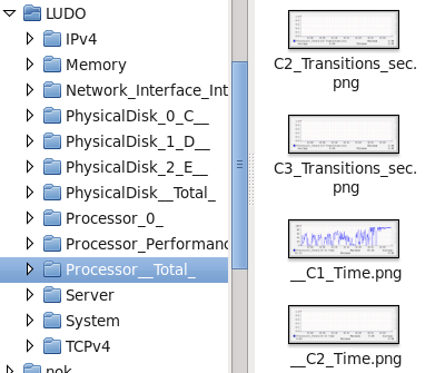
The script generate a folder with the name of the server (LUDO in my example) and a subfolder for each class of counters (as you see in Performance Monitor).
Inside each folder you will have a PNG (and an rrd) for each metric.
Important: The RRD are generated with a single round-robin archive with a size equal to the number of samples. If you want to have the rrd to store your historical data you’ll need to modify the script. Also, the size of the graph will be the same as the number of samples (for best reading), but limited to 1000 to avoid huge images.
Future Improvements
Would be nice to have a prepared set of graphs for standard graphs with multiple metrics (e.g. CPU user, system and idle together) and additional lines like regressions…
Download the script: process_l_php.txt and rename it with a .php extension.
Hope you’ll find it useful!
Cheers
Ludo