
During the last months I have had to deal with highly consolidated databases, where there was no basic rule to achieve something maintainable. Over many years (some schemas are 30 years old) the number of schemas and their dependencies became a problem up to a point where basic operations like patching or upgrading were very complex to achieve.
In order to try to split these big databases and move towards Oracle Multitenant, I have created some graphs that helped me and my colleagues to understand the connections between schemas (grants) and databases (db links).
Attacking the big beast with math algorithms to get a scientific approach on how to split it. Each color will likely be a separated PDB. Thanks @sandeshr and @HeliFromFinland for the inspiration given by your ML talks 🙂 pic.twitter.com/LQln0DwpQn
— Ludovico Caldara (@ludodba) October 22, 2019
All our “working” database links in a single image😳 pic.twitter.com/uxjLwmjUpa
— Ludovico Caldara (@ludodba) October 30, 2019
How have I created the graphs?
I used Gephi , an open source software to generate graphs. Gephi is very powerful, I feel I have used just 1% of its capabilities.
How to create a graph, depends mostly on what you want to achieve and which data you have.
First, some basic terminology: Nodes are the “dots” in the graph, Edges are the lines connecting the dots. Both nodes and edges can have properties (e.g. edges have weight), but you might not need any.
Basic nodes and edges without properties
If you need just to show the dependencies between nodes, a basic edge list with source->target will be enough.
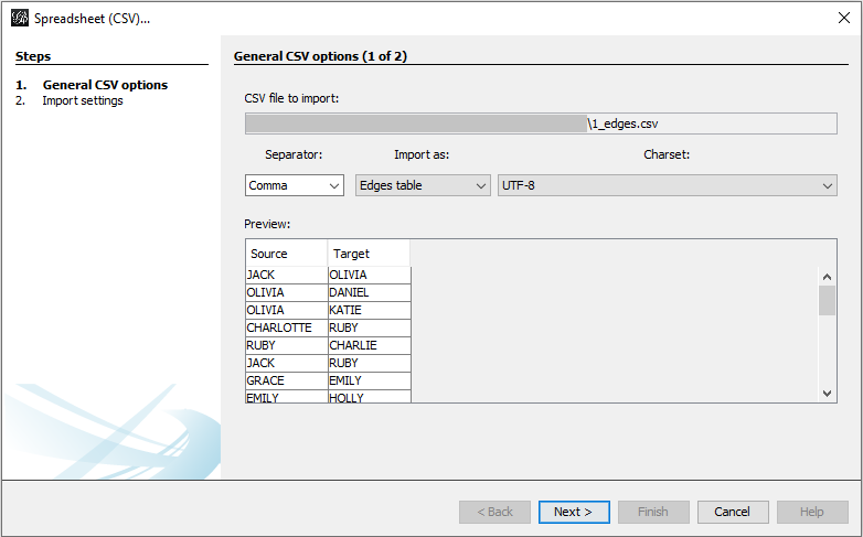
For example, you can have a edge list like this one: gephi_1_edges.csv
Open Gephi, go to New Project, File -> Import Spreadsheet, select the file. If you already have a workspace and you want to add the edges to the same workspace, select Append to existing workspace.
 This will lead to something very basic:
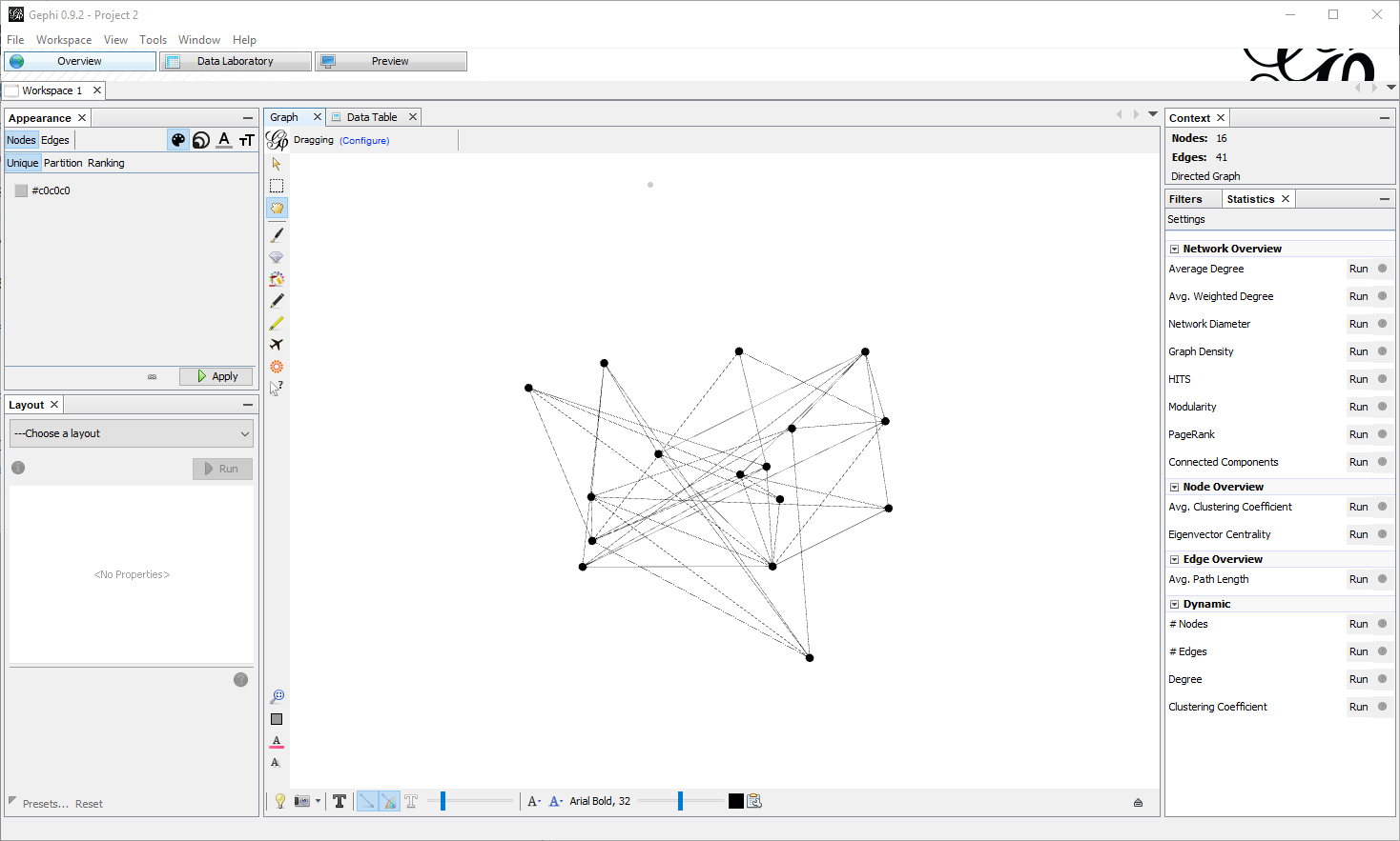
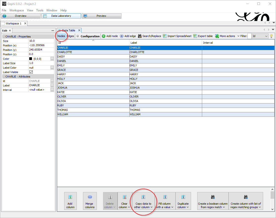
In the Data Laboratory tab, you might want to copy the value of the ID column to the label column, so that they match:
Now you must care about two things:
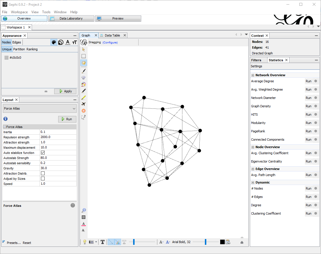
First, re-arranging the nodes. With few nodes this is often not required, but when there are many, the default visualization is not satisfying. In the tab Overview , pane Layout there are a few algorithms you can choose. For big graphs I prefer Force Atlas. There are a few parameters to tune, especially the attraction/repulsion strengths and the gravity. Speed is also crucial if you have many nodes. For this small example I put Repulsion Strength to 2000, Attraction Strength to 1. Clicking on Run starts the algorithm to rearrange the nodes, which with few edges will almost instantaneous (don’t forget to stop it afterwards).
Here is what I get:
 Now that the nodes are in place, in the preview pane I can adjust the settings, like showing labels and changing colors. Also, in the Appearance pane I can change the scheme to have for example colors based on ranking.
In this example, I choose to color based on ranking (nodes with more edges are darker).
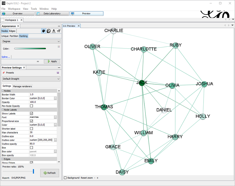
I also set the Preset Default Straight, Show labels (with smaller size) , proportional size.
Adding nodes properties
Importing edges from CSV gives only a dumb list of edges, without any information about nodes properties. Having properties set might be important in order to change how the graph is displayed.
By importing a node list containing the properties of each node , I can add important information. In this example file, I have columns Id, Label and Sex, that I will use to color the nodes differently: gephi_1_nodes.csv
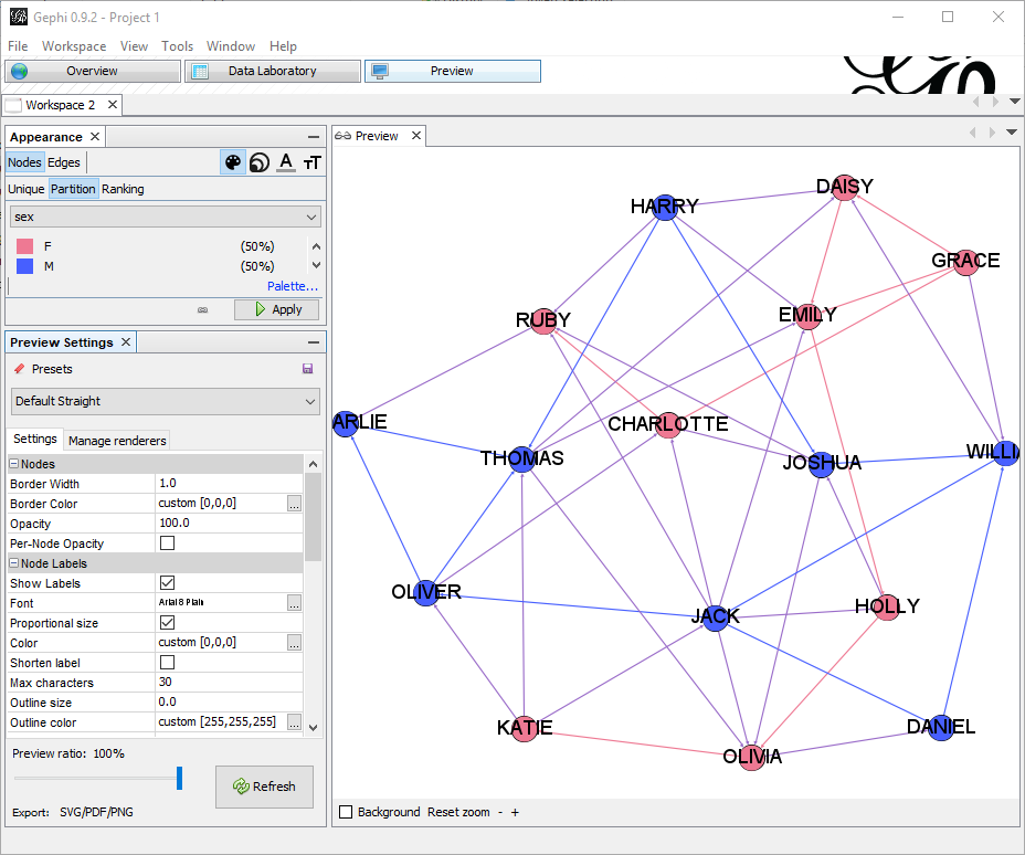
In the appearance node, I have just selected to partition by sex with a meaningful color.
Using real metadata to understand schemas or dependencies…
I will take, as an example, the dependencies in a database between objects of type VIEW, MATERIALIZED VIEW and TABLE. The database has quite a usage of materialized views and understanding the relation is not always easy.
This is the query that interests me:
|
1 2 3 4 5 6 7 8 9 10 11 12 13 14 15 16 |
SELECT owner, name, type, referenced_owner, referenced_name, referenced_type FROM dba_dependencies WHERE type IN ('TABLE', 'MATERIALIZED VIEW', 'VIEW') AND referenced_type IN ('TABLE', 'MATERIALIZED VIEW', 'VIEW') AND owner IN ( SELECT username FROM dba_users WHERE oracle_maintained = 'N' ); |
So I need the nodes, for that I need a UNION to get nodes from both sides of the dependency. The best tool to achieve this is SqlCl as it has the native CSV output format:
|
1 2 3 4 5 6 7 8 9 10 11 12 13 14 15 16 17 18 19 20 21 22 23 24 25 26 27 28 29 30 31 32 33 34 |
set sqlformat CSV set feedback off spool nodes.csv SELECT owner || '.' || name || ' (' || type || ')' AS "Id", owner || '.' || name || ' (' || type || ')' AS "Label", owner, name, type FROM dba_dependencies WHERE type IN ('TABLE', 'MATERIALIZED VIEW', 'VIEW') AND referenced_type IN ('TABLE', 'MATERIALIZED VIEW', 'VIEW') AND owner IN ( SELECT username FROM dba_users WHERE oracle_maintained = 'N' ) UNION SELECT referenced_owner || '.' || referenced_name || ' (' || referenced_type || ')' AS "Id", referenced_owner || '.' || referenced_name || ' (' || referenced_type || ')' AS "Label", referenced_owner, referenced_name, referenced_type FROM dba_dependencies WHERE type IN ('TABLE', 'MATERIALIZED VIEW', 'VIEW') AND referenced_type IN ('TABLE', 'MATERIALIZED VIEW', 'VIEW') AND owner IN ( SELECT username FROM dba_users WHERE oracle_maintained = 'N' ) ; spool off |
The edge list:
|
1 2 3 4 5 6 7 8 9 10 11 12 13 |
spool edges.csv SELECT owner || '.' || name || ' (' || type || ')' AS "Source", referenced_owner || '.' || referenced_name || ' (' || referenced_type || ')' AS "Target" FROM dba_dependencies WHERE type IN ('TABLE', 'MATERIALIZED VIEW', 'VIEW') AND referenced_type IN ('TABLE', 'MATERIALIZED VIEW', 'VIEW') AND owner IN ( SELECT username FROM dba_users WHERE oracle_maintained = 'N' ); spool off |
Using the very same procedure as above, it is easy to generate the graph.
I am interested in understanding what is TABLE, what is VIEW and what MATERIALIZED VIEW, so I partition the color by type. I also set the edge color to source so the edge will have the same color of the source node type.
I am also interested in highlighting which tables have more incoming dependencies, so I rank the node size by In-Degree.

In the graph:
- All the red dots are MVIEWS
- All the blue dots are VIEWS
- All the black dots are TABLES
- All the red lines are dependencies between a MVIEW and a (TABLE|VIEW).
- All the blue lines are dependencies between a VIEW and a (TABLE|MVIEW).
- The bigger the dots, the more incoming dependencies.
With the same approach I can get packages, grants, roles, db_links, client-server dependencies, etc. to better understand the infrastructure.
I hope you like it!